The Squirro Dashboard allows configuration of various data visualizations, based on the current Squirro project and data set.
The following widgets, each with its own visualization, are available to configure inside the Dashboard.
Table of Contents
Items
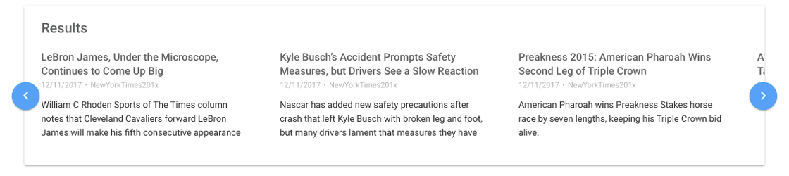
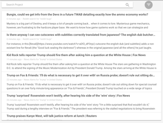
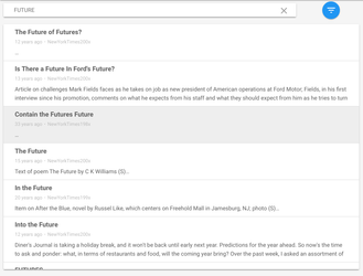
Result List
- The Result List widget simply displays a list of results, as seen on the Search page. Clicking on a result will show its content in a modal window.
- The widget works out of the box without any configuration, though it is possible to change quite a few features, including query/smartfilter highlighting, and the way items open on click (new window, modal window, with moving to the first matching pdf page in the case of a pdf document).
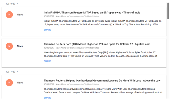
Horizontal Result List
- The Horizontal Result List lists the items In a horizontal list, with a left/right scroll buttons.
- Configuration is mostly same as the vertical Result List widget, i.e., supporting opening the item details in modal window, as well as query / smartfilter highlighting.
- The widget also shows the number of duplicated items for each item in the top-right corner, should such items exist and duplicates have not been disabled in the widget's configuration.
Cards
- The Cards widget shows the list of items packed inside the cards.
- Additionally, it can be configured to visualise the source type, to group items by date and can have a button to share the item link via email.
- The whole card area is clickable; when clicked, the card expands to show the full item, with body and keywords.
Navigation
Tabs (Previously known as Bookmarks)
- As the name implies, tab widget is designed to be used as a navigational component.
- It can be used to display tabs or a dropdown list with predefined queries behind them, used to filter the Dashboard.
- It can also be controlled by dashboard store where user is required to define store key and for each tab, a key value. In this way, the key-value combination can be used to formulate the visibility condition for a layer.
- The Bookmark links can be displayed as Vertical tabs, Horizontal tabs and Dropdown list.
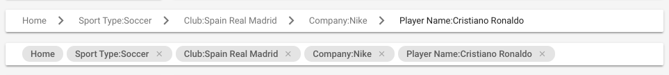
Breadcrumbs
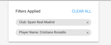
- Breadcrumbs widget displays the crumbs or the path to the current state of the dashboard.
- It comes with two modes: Breadcrumbs and Chips.
- Breadcrumb mode is a pure trail of the filters applied to reach a particular state of a dashboard.
- Chips mode display all the filters in the tag component with a X button. Users can remove any filter from this mode of the widget and the dashboard reloads with the new combination of filters.
- By default the user sees 'Home'.
- When the widget is not wide enough to display all the filters, it hides the initially applied filters behind ellipses and shows you the last few ones so you can easily find your way back.
Link
- The Link widget can be used to display a link to a url.
- Just like the bookmark widget, it can also be controlled by dashboard store where user is required to define store key and a key value. In this way, the key-value combination can be used to formulate the visibility condition for a layer.
Reset
- Reset widget is conceptually similar to the breadcrumbs widget as it shows the list of filters applied to the dashboard and allows the user to clear them.
- The round filter button comes in two modes: Big and Small.
- On hover over the filter button, the panel with filters list opens.
- User can choose to either clear one or multiple filters. They can also remove all the filters at once by clicking on the 'CLEAR ALL' button.
- When no filter is applied, the widget is displayed in inactive state.
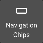
Navigation Chips
- Navigation Chips is conceptually similar to and functions like Tabs widget. It is also configured the same way.
- Instead of tabs, it offer toggle-able chips to control the dashboard by query or dashboard store.
- Main difference between the two is that the 'Tabs' widget will always have 'ALL' tab as the first tab whereas the Navigation Chips widget will not have the ALL tab and no chip will be selected by default.
Filters
Search Bar
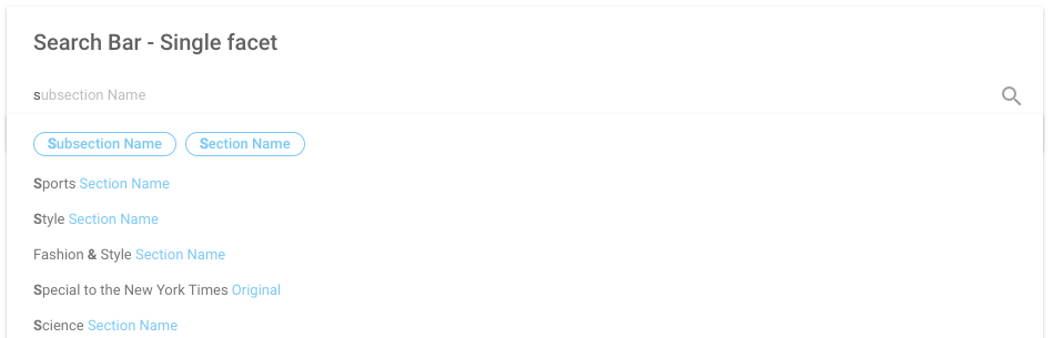
The Search Bar widget is essentially a Squirro Search box, with the exception that it's aimed at refining the current dashboard query, rather than fully controlling it.
Any query put into the widget will be combined with the current dashboard selection using an AND operator.
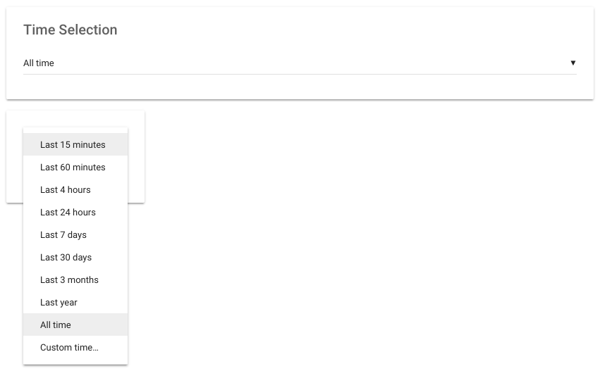
Time Selection
The Time Selection widget can be used to display a predefined set of time based queries. This can also be configured to be shown as a dropdown.

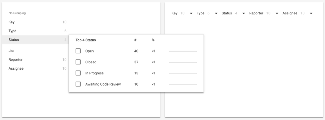
Facets
- The Facet List widget can be configured to display all contributing facets in the project or combination of desired facets.
- Hovering over the facet field displays the distribution of actual facet values, sorted by top 10 values.
- Clicking on an individual value filters the result list. Multi-selection of values is supported as well by pressing the modifier key, Cmd for Apple Macs, Ctrl for Microsoft Windows systems.
- The widget can be displayed as a list and as dropdown buttons.
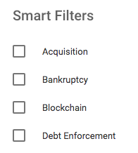
Smart Filters
The Smart Filters widget can be used to display the list of currently defined Smart Filters and apply them to the Dashboard.
Trend List
The Trends widget can be used to display the list of currently defined Trends.
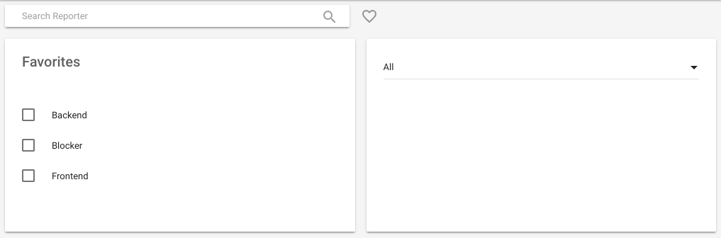
Favorites
- The Favorites widget can be used to display queries that have been marked as Favorites or for which an Alert has been defined.
- Clicking on the Favorite (heart) icon, marks the current query as Favorite. The heart icon can be displayed by enabling the searchbar widget to 'Show Favorite button'.
- The widget can be displayed as a list and as dropdown buttons.
Over Time
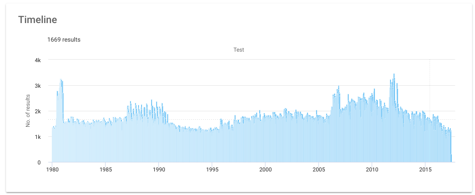
Timeline
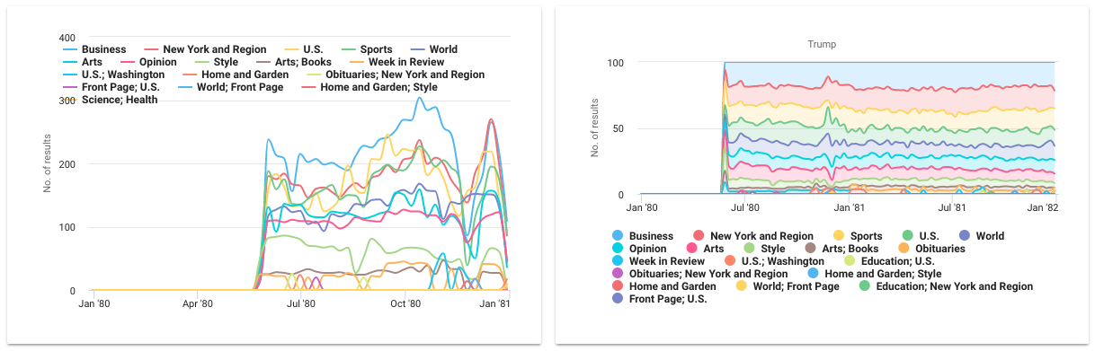
Line Chart
- The Line chart displays facet values of one facet in the form of a time based line chart.
- This is be particularly useful if the dataset contains dates in one of the facets.
- The only configuration required is to provide a facet to display on the chart.
Comparison
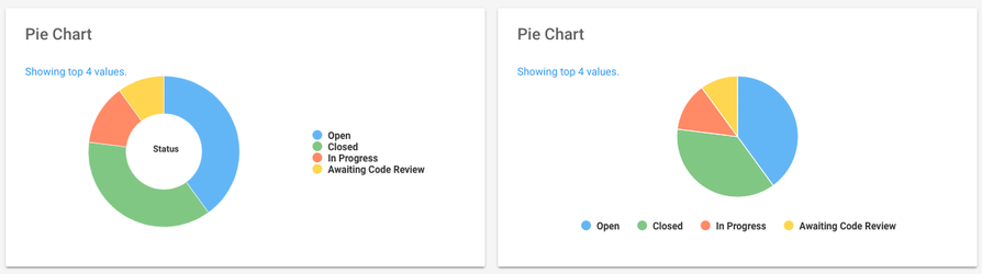
Pie Chart
- The Pie Chart is used to display values of a specific facet in a classic pie or a donut format.
- The only configuration required is the facet, which values are populated on the chart.
- Chart legend can be enabled and can be positioned below or on the right of the chart.
Bar Chart

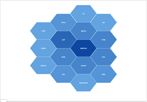
Word Cloud
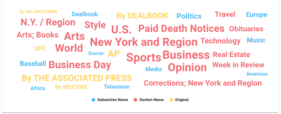
- The Word Cloud is used to display values of several facets (max. 8) in a word cloud format.
- The only configuration required is the facet, which values are populated on the chart.
- Widget legend can be enabled / disabled as required.
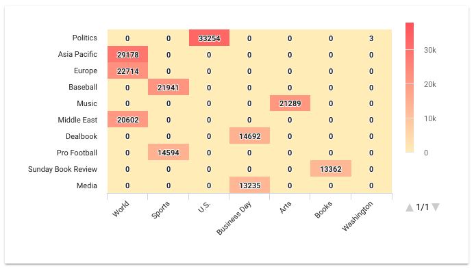
Heat Map
- The Heat Map is a convenient way to represent the aggregations between two facets present in the project. During the configuration, facets for both of the axis are chosen, as well as the maximum size of the resulting matrix (the actual heat map). The data generation first resolves top values for the first facet, then for each of the top values aggregates over the second chosen facet, determining the weight of the connection between both facets. The weight determined is then used to present the number of mentions of both facets in items, present at the same time.
- Clicking on a box in the heat map will drill down the current query to items which satisfy both facet value conditions as per the clicked box.
- Additionally, it is possible to specify both the starting and ending color point for the Heat Map gradient, the starting point being the color applied to lowest values (mention counts), the ending point being the color applied to highest values. Color for all intermediate values is determined automatically via interpolation.
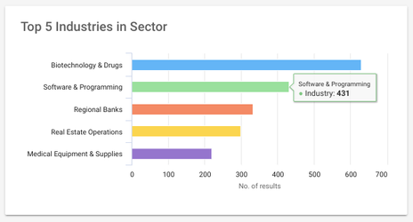
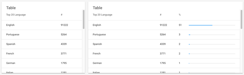
Table
- The Table widget displays the top values for a facet in a table format, along with the number of matches and their relative contribution in percentage in the analysed documents.
- The relative contribution percentage can be hidden if desired. Besides, the widget is responsive in nature. When not enough space is available to display the horizontal bars, the widget hides them automatically.
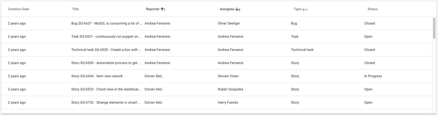
Facets Table
- The Facet Table widget is used to display values of specific facets for every document in the result list.
- It allows displaying additional fields like title, body and creation date in the columns.
- Column width can be re-sized when the dashboard is in "Edit Mode".
- The entire dashboard (and subsequently, the widget itself) can be sorted by any facet or multi-sorted by combination of facets.
- Clicking on a row display the item either in the side panel or in a modal window.
Geographical
World Map
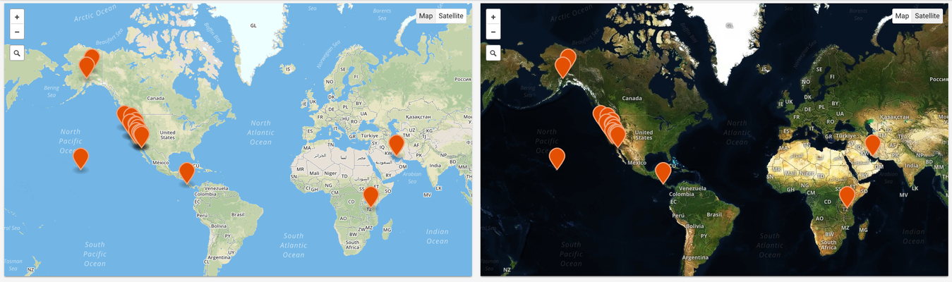
- World map widget displays allows you to visualise the geographical data on a worldmap.
- Inorder for this widget to work, the items need to be tagged with their geo-point co-ordinates.
- The widget offers map view and satellite view along with zoom and search functionality.
- Dragging and zooming the map causes the dashboard to filter by the markers visible on the widget.
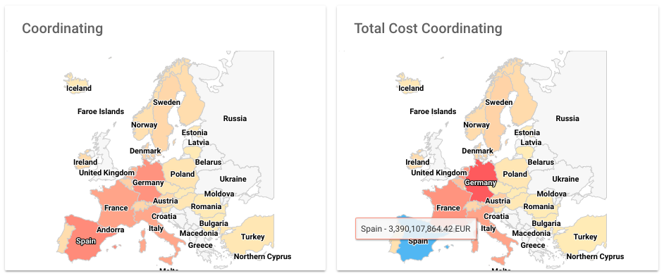
Region Map
The region map can be used for map based data visulizations.
Special
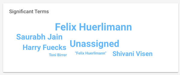
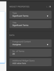
Significant Terms
- The Significant Terms provides visual information about terms which are especially significant in a dataset, comparing to another dataset.
- Significant Terms allow to reveal the uncommonly common. This means, that it shows which terms show a significant different value distribution in a foreground-dataset when compared to a background-dataset. This requires a certain amount of documents to work, the more terms there are in a facet, the more documents are needed to get a meaningful answer. In Squirro the background-dataset is what is defined in an unmodified dashboard. The foreground-dataset is constructed from the background-dataset and includes the current selection. If there is no selection, meaning that the foreground- and the background-dataset are equal, the term frequency is shown (except if the facet is
body,titleorsummarywhere this operation is too costly). - Significant terms work very well on facets with few values, meaning if computed on a
body,titleorsummaryfield, there are much more documents needed to get a significant term to show-up. One workaround for this restriction is to use phrase- or term detection and index those phrases/terms in a separate facet field. This has shown to improve the results vastly while also not requiring a lot of documents. - When configuring over a special content field (body, title, summary), one is asked also to provide language and the maximum number of results returned.
- The maximum number of results field affects performance, so exercise with caution when increasing the limit.
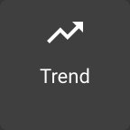
Trend
The Trend widget is used as part of the Trend Detection to visualize the trend, anomalies and predictions for data in a project.
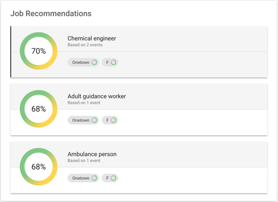
REC Results
Use entities or facets to create Recommendations.
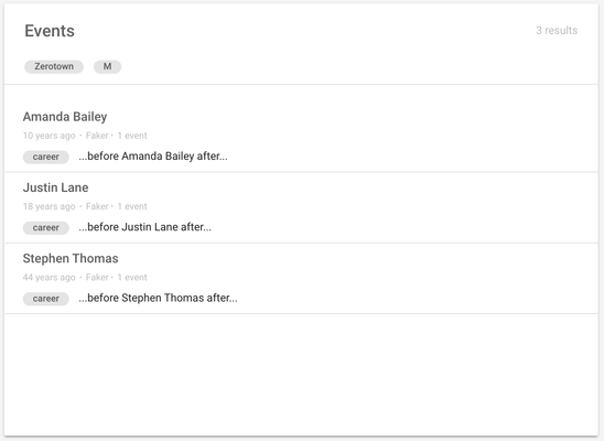
REC Explanations
The Entities List show items related to recommendations using entities.
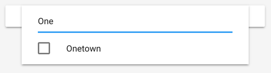
REC Input
The Entities dropdown can be used in conjunction with the Recommendations and Entities List widgets to explore recommendations and items.
Topic Cluster
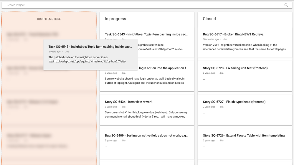
Kanban Lane
- Kanban Lane widget allows you to wrap your items with process based functionalities like triaging, prioritizing, changing the state, etc.
- Add multiple widgets to the dashboard and drag and drop the items from one lane to the other to quickly tag them with predefined keywords.
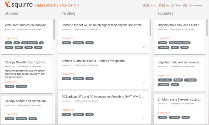
Data Labeling Lane
Others
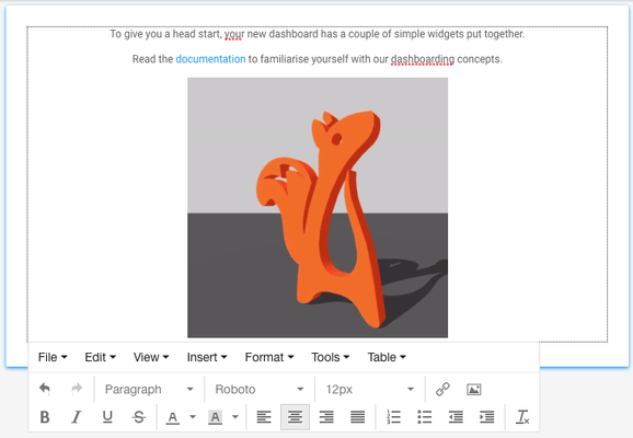
Rich Text Editor
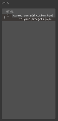
HTML Editor
The HTML Editor widget can be used to add static html text content to a Dashboard.
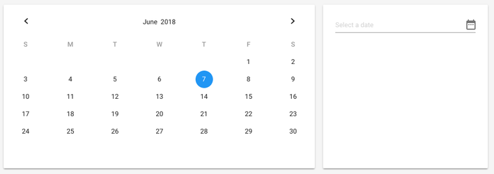
Calendar
- Calendar can be used to select individual days with a calendar interface.
- The widget is responsive in nature. When not enough space is available to display the calendar component, the widget automatically switches to a calendar dropdown mode.
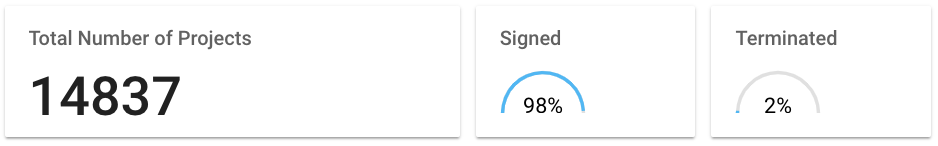
Metric
- Metrics widget can be used to display the count of a single metric to create high level summary of the dashboard. Example: No. of incidents reported.
- The widget needs to be configured by a 'Base Query', which is the query behind a particular metric.
- To see the percentage contribution of one metric over the other, both the 'Base Query' and the 'Sub Query' need to be defined. Example: Percentage of tickets closed out of total tickets.
- The percentage contribution is displayed using the percentage gauge variation of the widget.
IFrame
- The IFrame widget allows embedding websites into the Squirro Dashboard. The configuration has one parameter only, the URL.
- In order to embed a website as an iFrame, it must itself support that via X-Frame-Options, aswell as being served via the same protocol as Squirro itself (http / https).
- The URL must be well formatted, including the protocol (eg. http://www.squirro.com).
- There are several parameters in the URL that one can use to extend the functionality. Using those optional parameters allows a limited channel of communication to be created between Squirro and the embedded webpage.
- %s - will be replaced by the current Dashboard query when resolving the URL.
- %ta - will be replaced by the beginning of the current Dashboard time range (time-after) (if one is defined).
- %tb - will be replaced by the end of the current Dashboard time range (time-before) (if one is defined).
- %u - will be replaced by the currently logged in user's name.
- %p - will be replaced by the current project's title.
- %d - will be replaced by the current (containing the IFrame widget) dashboard's title.
- %q[query_param] - will be replaced by the embedded dashboard's URL query param of the name query_param.
This is particularly useful in scenarios where the embedded dashboard gets injected some parameters from the outside environment.
By referencing them in the iFrame widget, it is possible to trickle them down to the referenced web endpoint.
Custom
New widgets can be created and made available using the Custom Widgets API.