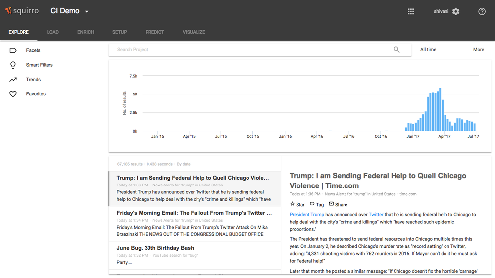
The main UI you encounter upon loading a new Squirro instance entering the Project setup space is the Search screen. Explore screen. Explore page is a pre made dashboard that allows the users to analyse the enriched data with respect to the features Squirro offers like typeahead, faceted search, smart filters, trends, and favourites, all in one. Depending on your data, this screen may be loaded with data or waiting for you to upload your data. Like Like everywhere else in Squirro, all elements of the UI are connected, so e.g. the entire dashboard will be filtered by selecting a particular value for a facet or filter from the filter panel or by selecting a particular time range in a chart changes the entire Dashboard and selecting a facet on the Search Screen will change the results displayed and the Frequency Graph.
Main UI elements
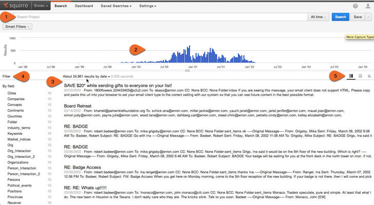
The Search Field (1)
The Search Field accepts your search query.
Main UI elements
Filter panel (1)
To the left of the page, is a filter panel with core entities like Facets, Smartfilters, Trends and Favourites listed together. While Facets, Smartfilters and Trends have their own personal management space under the tabs Load, Setup and Predict, they can all be consumed together on the explore page. At the very least, the facets include document metadata filters like source, language etc. The list can grow to include facets custom created by running some enrichment pipelets on the data. All core entities mentioned above will be covered in detail in their respective sections.
View interactive GIF
The Searchbar (2)
The Searchbar not only accepts your search query, it also supports type ahead. You can use operators (see below) to make your query more efficient. To execute your search, press the Search button button. You can save your query using the Save buttonas a favourite filter by using the More button.
The Frequency Graph (
...
3)
The page is headed by the Frequency Graph, displaying the frequency of documents that meet the search query over time. You can use this to manually refine the time range and to gain an overview over the temporal distribution of your data. Once you have selected a range, you can use the Zoom to selection command in the right upper corner of the Frequency Graph to focus in on a particular range of time.
Results list (
...
4)
The results are displayed below the Frequency Graph. These results represent documents that match the search query.
Filters (4)
To the left of the results, Filters are represented as a column. These filters include document metadata filters (such as source filtering) and filtering by facets (under the 'By field' item).