The Squirro Dashboard allows configuration of various data visualisations, basing based on the current Squirro project and dataset.
The following widgets, each with its own visualisation, are available to configure inside the Dashboard:
...
| Table of Contents | ||
|---|---|---|
|
Chart Types
Pie Chart
BB Note: should the title below be in English
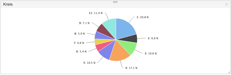
The Pie Chart is used to display values of a specific facet in a pie format, with legenda pie chart legend can be enabled if required through the settings.
The only configuration required is the facet, which values are populated on the chart.
...
The Cloud chart displays values of several (between 1 and 6) different facets at once.
Each facet is can be assigned a color disired colour in which it is displayed on the chart.
...
To configure, provide a facet which values to display on the chart.
Significant Terms
BB Note: should this be in english, could manipulate image would be easier..
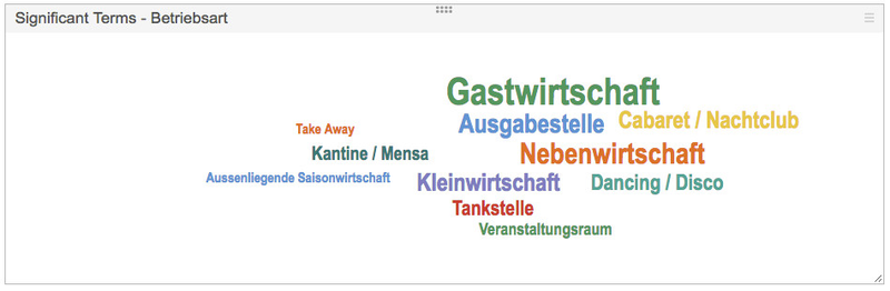
The Significant Terms provides visual information about terms which are especially significant in a dataset, comparing to another dataset.
...
Additionally, it is possible to specify both the starting and ending color point for the Heat Map gradient, the starting point being the color applied to lowest values (mention counts), the ending point being the color applied to highest values. Color for all intermediate values is determined automatically via interpolation.
Facets Table
BB Note: Can we mask the email addresses
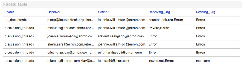
The Facet Table widget is used to display values of specific facets for every document in the result list.
...
Hovering over the facet field displays the distribution of actual facet values, sorted by top 10 values.
Clicking on an individual value filters the result list. Multi-selection of values is supported as well by pressing the modifier key, Cmd for Apple Macs, Ctrl for Microsoft Windows systems.
Horizontal Result List
BB Note: Cover flow is mostly Mac specific, most readers might not know what cover flow is, do we need this mentioned ?
The Horizontal Result List shows the list of items, according to dashboard selection, in a horizontal, CoverFlow-esque control, with a left/right navigation.
...
Dashboard configuration
BB Note: should this section logically be the first in this page
To configure a dashboard, it has to be created first.
...
NOTE: When editing an existing Dashboard, changing properties in the widget configurator will not actually perform a save on the dashboard itself. To save a dashboard, the user is expected to press Save at the bottom of the page.
BB Note: can the pie chart in the english
And that's how this Pie Chart widget looks after configuration.
...
The following screenshot shows the significant terms on the left, without any selection:
BB Note: can the sig terms be in the english
-1%20(1).png?version=1&modificationDate=1422980637061&cacheVersion=1&api=v2&width=800)
-2%20(1).png?version=1&modificationDate=1422980641335&cacheVersion=1&api=v2&width=800)
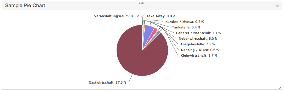
The Significant Terms configuration for facet content fields looks like the following:
...